Friday, June 11, 2010

lab 8


On the top map, there is the asian population in the United States. As we can expect, the Asian population is the highest in the South West of the United States. This is probably due to what happened over the past 100 years. A lot of Asian immigrants moved from Asia to the United States. The closest distance from Asia to the United States is obviously in the west coast. The Asians thought that the best place to live in the West is in California. This is why there is such a high concentration of Asians in this states.

On the bottom map, there is a map about the Black population in the United States. As we all know, there is a huge amount of black population for the past hundreds of years in the South of the US, actually since the beginning of the United States when slavery was abolished. However, after all the wars and racism in the South, some of that population moved towards the North.
For the other race, we can see that it is highly populated in the South west and the west coast. We can easily imagine that this other race population represents mainly the Hispanic population in the United States. The South and Southwest of the US is closest to Mexico and South America and this why the Hispanic population tend to go to California and other states in the South such as Florida or Texas.


Tuesday, May 18, 2010

Lab 7


In this lab, we worked in obtaining data for some of the LA county fires that occurred in the month of 2009. All the data was collected from the resources below. Some of the resources actually had files that could be downloaded on ArcGIS so that it fits on the same LA county map. I took several parameters which I thought were important for the effects this fire could have on the environment and to the people. I included the populated places, the urban area, the airports, and the parks. I also included the fire extension on different dates.

I included the populated place because a big fire could have an important effect on people. A fire like this could make the people leave the area because it could create a lot of problems. For the people that live in the area where the fire occurred, it could easily endanger their lives. Then, I also had an interest on the urban area because with this fire, it could easily damage a lot of the urban landscape which is probably the most important area for anyone. Then, the airports. I plotted the airports for 2 reasons: the first one is to know if the planes were possible sources for those fires and the second is are the fire in proximity to the airports? The effects could be disastrous. Then, the parks. I included them because a lot of people spend their leisure time at parks so this is to see the effects on the environment.

I felt the fire extension was a very important point for this map. I feel this is very important because of the evolution the fire has within a span of a few days. We can see that at the end of August, the fire is relatively small. However we can see that a few days later at the beginning of September, the fire perimeter has dramatically increased which can have disastrous effects on the environment.

To be more precise, I took some data from the LA times. On August 31st, 2 firefighters got killed and 85000 acres got destroyed overnight. 18 homes were lost during that night and plenty of neighborhoods had to be evacuated. More than 12000 homes were threatened and 6000 had to be evacuated. The consequences of this fire last summer were absolutely dramatic. This is why the LA fire department has taken measures and create a wildfire action fire plan in case a fire like this occurs again.

As we all know, the consequences of a fire can have absolutely devastating consequences for the people and the environment we live in. However, by taking measures, less damages could be produced. Using ArcGIS, we have a good estimation of what the consequences of a fire can be by looking at its progress over several days. Using the data collected from the internet, we see what gets affected because of those fires.

Tuesday, May 11, 2010

lab 6


The area I chose was approximately in Los Angeles. The extent information are approximately at 34.03 degrees North and 118.15 degrees West. The extent in degrees was approximately from 0 to 46 degrees. We had to change the units from degrees to meters because of the wrong units that was used as default

Wednesday, May 5, 2010

Lab 5


Map projection is important in the world of geography. There is no way that geographers could always work with a spherical globe every time they have to make distance measurements. The spherical globe is very important as it is the best approximation of the earth but there must also be some alternatives. This is why we have so many types of map projections. When I was young to study the French and European map, we always used the equidistant cylindrical map. This map is very useful because it is equidistant and the easiest to understand and to make measurements.

It is very easy to understand because we are working in two dimensions and we could just make straight line measurements between two cities. Even though this easiness is very attractive for working with maps, it can be quite inaccurate for actual distances because it is a poor approximation of the world. For example, if you want to fly from Washington DC to Kabul, you are not going to go straight going through France and Germany and other European countries to reach Kabul. You would actually go North to Greenland and Iceland as this is the fastest way to get to Kabul considering spherical maps.

The cylindrical view is not the only view we can use. Another very useful projection is the equidistant conic view. It is another type of equidistant projection. Here we have a view on the North pole and flatten the earth. It is very similar to the cylindrical view but the North pole is at the center. The conformal maps are more accurate than the equidistant but there are less intuitive. the Mercator and equidistant cylindrical are very similar except that the Mercator is more accurate and has more distortion. The Robinson projection is a map with spherical shape but in two dimensions instead of three. Another type is the equal area projection where countries and continents seem to have obviously an equal area. This is the least intuitive of all maps in my opinion.

As we saw above, there are many type of map projections that exist. For our class, we divided them into three groups: equidistant, equal area and conformal. We also saw that the equidistant projection is very intuitive but not very accurate while the conformal is more accurate, it is less intuitive because of the distortions. All map projections have a particular purpose: it could be for accuracy, intuition or other types such as the equal area projection. It is not very intuitive because of the heavy distortion. Any map projection has its own purpose

Monday, May 3, 2010

Geography 7 Lab 4


This experience of learning ArcGis was interesting. The tutorial took a long time, but that time spent on leaning a little bit about this software was worth it. Since I was very young, I learned geography back when I was in France simply because it was one of the major requirements there. Since I am a very scientific person (I am an electrical engineering major), and I learned geography since I was young, I know very well what everything we are learning is all about and the importance of understanding maps.

However, this class about geographical information systems is more than just learning maps. I knew when I was a kid that we could make maps. I could make them by hand or use special machines from satellites to camera to take pictures of the entire earth or part of a city. Ten to fifteen years ago, after Internet became popular and starting to become widely usable, I realized that many of those pictures taken could be found on the Internet with much more accuracy than with a camera. Being able to export pictures with great accuracy is great but the invention of one with the same accuracy was a tough challenge faced by engineers, especially computer scientists. After years of work, computer scientists were finally able to create softwares that enable us to create any type of map we desire with perfect accuracy to the human eye. One of the softwares was ArcGIS, which is the software we use for this class.

Using ArcGIS, you can make any map about any topic. It is possible that I could use this software later in my electrical engineering studies if I have to make map of the world showing the areas where the largest amount of semiconductor chips are made for example. In our case, we used an example of the proposed airport expansions. In the first map, we made a map showing the school and noise contour because of the effects of the surrounding airport. Then in that map, we created a road connecting other roads that avoids the school area. In the second map, we made a more detailed analysis of the land use and noise contour where we had different colors representing the amount of noise in the specific area that we are working on. To show even more detail, we made a bar graph of the number of parcels at different areas. In the last graph, we considered a very important and obvious map to include: the population density map.

In this lab, we made different maps with different subjects but are all linked to each other if we look at the big picture. We see here that using software to make maps are very useful in research subjects for school but also in real life. It could be very useful for people working on history as well as the people working in engineering. This tutorial showed us the wide quantity of functions that the ArcGIS software has and we will see in the next few weeks how this sofware can be applied to any topic in real life concerning maps. This is why we have a project at the end of the quarter that will use the ArcGIS software.

Tuesday, April 13, 2010

Lab 3 Digital Maps


View The biggest tennis tournaments in the world in a larger map

Neogeography means "new geography". To be more precise, and from the definition on Wikipedia, it is "the application to the usage of geographical techniques and tools used for personal and community activities or for utilization by a non-expert group of users". When we think about it, we use neogeography in our everyday lives. For example, when we want to go to public affairs to do the lab for geography 7, we walk through bruinwalk, then walk towards North Campus to reach Bunch, then Public affairs. However, there are many paths to get there and all of us have different paths. This is why we have neogeography. We use a map and we make our decisions on what directions to choose to go from place to place. However, we do not necessarily have to have our own map. We could make our own map.

In the lab we did today, the only map I used was the map of the Earth given by Google Earth. However, I could have done this entire lab by having me draw a map of the Earth and do the lab. This is a form of neogeography. Adding information like I did on a blank map like the whole class did is also a form of neogeography. We are not experts on the matter but we add information to a map that does not have this information and that could be useful for anyone interested in the matter. For my lab, if someone likes traveling all over the world and has a passion for tennis, then the map I created will be very useful for that person. He will realize that the main spots for the biggest tennis tournaments will be in New York, Paris, London and Melbourne. The map I created is not available anywhere and this is what makes neogeography so useful in addition to the help of the Internet. With the help of the Internet, any information about any type of map is available within a few clicks.

Neogeography has always been useful in the past. However, when the Internet became popular, neogeography has really been fostered and we all see why it is useful in our everyday lives. Neogeography has also helped create the GPS, which is by far the most important tool if anyone needs to travel to a certain place without having the knowledge of the place. As the technology will continue to evolve, neogeography will become even more useful in the future even though it already is essential to everybody's lives today.

Friday, April 9, 2010

Lab 2

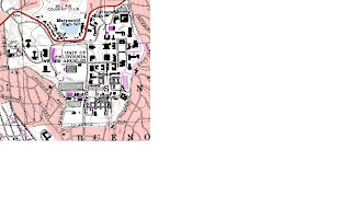
1. The name of the quadrangle is "Beverly Hills" located in California, Los Angeles

2. The names of the adjacent quadrangles are: Canoga Park, Van Nuys, Burbank, Topanga, Hollywood, Venice and Inglewood.

3. The quadrangle was first created in 1966

4. The datum used to create this map is:

Vertical datum: North American datum of 1927

Horizontal datum: North American datum of 1983

5. The scale of the map is 1:24000

6. a) 1cm on the map is 24000cm or 240m on the ground. Therefore, 5cm is 240*5 = 1200m

b) 5 inches is 120000 inches on the ground or 120000/63360 = 1.89 miles

c) 1 mile or 63360 inches on the ground is 63360/24000 = 2.64 inches on the map

d) 3 km or 300000cm on the ground is 300000/24000 = 12.5 cm on the map

7. The contour interval is 20 feet

8. a) Public affais building: 34 degrees, 4'40''N and 118 degrees, 26'25'' W or 34.078 degrees N, 118.44 degrees W

b) Santa Monica Pier: 34 degrees, 0'30''N, and 118 degrees, 30'0''W or 34.01 degrees N, 118.5 degrees W

c) Upper Franklin Canyon reservoir: 34 degrees, 7'0'' N and 118 degrees, 24'30'' W or 34.12 degrees N and 118.408 degrees W

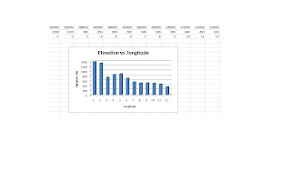
9) a) Greystone Mansion: 520 feet

b) Woodlawn cementary: 140 feet

c) Crestwood Hills Park: 700 feet

10) The UTM zone of this map is 11

11) The UTM coordinates for the lower left corner of the map is 3762800 N 361500 W

12) We know that we get a 1000 meter increment as we change UTM grid lines one by one for both the latitude and the longitude. Therefore, the area of the lower left corner will be:

(3764000-3762800)*(362000-361500) = 1200*500 = 600000 m^2

13) Attached

14) The magnetic declination is 14 degrees

15) The water flows from North to South

16) Attached


13) then 16)
Tuesday, March 30, 2010

Geog7 week 1


This map is a map showing the energy consumption all over the world between 1989 and 1998. The scale of this map is 10^15 Btu. We can see that when the color is grey or green, either the consumption is not given or almost zero. However, when we get to red, the consumption is very high. We can observe that the consumption of energy is very high in large countries such as the United States and Russia and that it is very low in Peru for example.
Source:

http://images.google.com/imgres?imgurl=http://upload.wikimedia.org/wikipedia/commons/7/7d/Energy-consumption-World2.png&imgrefurl=http://www.maximizingprogress.org/2008_01_01_archive.html&usg=__xB_1mu7PQjgJB_bmdo8NDI2Y1GA=&h=628&w=1427&sz=53&hl=en&start=5&sig2=SpTe7KL7fc7V-y46yNCH5g&itbs=1&tbnid=WZvvGT5JVYTcTM:&tbnh=66&tbnw=150&prev=/images%3Fq%3Dmap%2Bof%2Bworld%2Bcar%2Bproduction%26hl%3Den%26gbv%3D2%26tbs%3Disch:1&ei=G1qyS_WlFpPutQPwrv2ZAQ

Title: World Energy activity
Author: Joost Bonsen
Publication date: 01/18/2008 at 19:33


This map is a map of the French speaking countries in the world. We can see and understand that when the countries are colored light-blue, there are French speaking countries. When it is Dark blue, there are not. For example, France, Canada, countries in Western Africa are light-blue since there are French speaking countries. However, countries such as Spain, the United States are dark blue.


Source:http://images.google.com/imgres?imgurl=http://www.educnet.education.fr/data/carte_membres.gif&imgrefurl=http://www.educnet.education.fr/en/international/francophone/activities&usg=__sDK2BuJ5UbsbEUISUK4WIk5LSfk=&h=321&w=540&sz=26&hl=en&start=4&sig2=D485_hrtY2cFdX1lb8rYdg&itbs=1&tbnid=9mvgFfb2vktfwM:&tbnh=78&tbnw=132&prev=/images%3Fq%3Dmap%2Bof%2Bfrench%2Bspeaking%2Bcountries%26hl%3Den%26gbv%3D2%26tbs%3Disch:1&ei=p1iyS_OEIKLeswP6ism9AQ

Author: Educnet

Publication date: 11/18/2007


This map is the map of the United States population. As we can see in the scaling of the map, the more red a part of the map is, the more populated it is. The scale is in thousands of people. We can therefore clearly see that the NorthEast (New York, Pennsylvania), SouthEast (Florida) and West (California) are the most populated areas of the United States. There are actually millions of people living in those areas. We can also see that in the Midwest, a lot of the rectangles are white which means that the population in this area is very low.


Source: http://images.google.com/imgres?imgurl=http://www.mapsofnewmexico.com/images/USA-Population-Map.gif&imgrefurl=http://www.mapsofnewmexico.com/AccordianTabs/USAMapsandGuides/USApop.php&usg=__J2dSZrNn3ZpsJQ3RCGRLDUgKJH0=&h=582&w=751&sz=54&hl=en&start=5&sig2=XEf2X1NqVcRcYcARCDlxWw&itbs=1&tbnid=zXnZkiD-L9MaxM:&tbnh=109&tbnw=141&prev=/images%3Fq%3Dunited%2Bstates%2Bpopulation%2Bmap%26hl%3Den%26gbv%3D2%26tbs%3Disch:1&ei=81ayS4ifA4zoswOxme27AQ
Author: Travel Bug

Publication date: 03/30/2010